Hey there
As a versatile UX Designer with a proven ability to adapt to diverse branding needs, I thrive in collaborative environments where I can contribute to meaningful projects from start to finish. With a strong foundation in strategy, wireframing, visual design, and motion design, I excel at creating elegant and impactful solutions that resonate with both clients and internal teams. My experience working with multiple clients has honed my ability to seamlessly transition between different branding styles and deliver exceptional results. I am a problem-solver at heart, always seeking ways to improve processes and deliver exceptional results.
Beyond the realm of design, I find inspiration in various artistic pursuits, including dance, nature, and literature. These experiences enrich my creative process and contribute to my ability to develop innovative and engaging solutions.
What I’m Currently Working on
WHere I Am Currently
For this project, we're prioritizing a mobile-first approach based on user research that identified mobile devices as the primary platform for our client's target audience. By starting with low-fidelity wireframes, we're focusing on establishing a strong information hierarchy and ensuring optimal functionality. This project marks the client's transition to a decoupled architecture, allowing for greater flexibility and scalability. We're working closely with our development team to break down the design into reusable components and demonstrate their application in various use cases.
First round of wireframes/high-fidelity:
Current 404 page, Search Results, and No Results Found.
Approved wireframes.
Integrating brand team illustrations, along with layered images coinciding with their new brand campaign.
Opportunity to add sponsored content.
Integrating a new filter when a user searches for anything existing on the site to access any articles or landing content type faster.
Adding Filter Tags after filter is applied to easily remove if the user chose to do so.
Having Search Results be placed in reusable card components.
Adding pagination.
Second round of wireframes/high-fidelity:
Current Partner Listing and Event Listing Page
Proposed wireframes.
Integrating breadcrumb for a better user experience.
Removing google api map as a more conservative approach, while still giving the user the opportunity to open google maps through location link.
Adding static map illustration instead to highlight region where partner/event is located.
Adding “earn points badge,” to drive more traffic to their mobile trail pass.
Updating image carousel for a more accessible experience.
Introducing a tab component so a user can easily toggle between details and amenities and or dates without having to scroll far.
Opportunity to add “Featured In” articles or Related Events within the region.
Third round of wireframes/high-fidelity:
Current Editorial/Editorial Components
Proposed wireframes.
Introducing layered imaging to replace Hero Image as a callout to integrate their new brand campaign.
Option to have a colored block if the editor chooses to only have one image.
Adding frame for illustration for the editor to use what is provided by their brand team that correlates with article.
Introducing breadcrumb.
Introducing a mosaic tile component to desktop and keeping that experience into mobile to provide a more unique off beat experience that encapsulates the destination.
Showing how each mosaic tile can be reused within article types. (Updated to Carousel while keeping staggered imagery)
Providing a numbered input field for listicles that will allow the copy to have an image or video break while still maintaining hierarchy of the list.
Showing what a sponsored editorial would look like for their partners.
South Dakota Dreamscapes is the first of 2 bento grids proposed to our client. The mood-board presents a visually appealing and informative design for a South Dakota tourism website. The overall aesthetic is clean and modern, with a focus on natural elements and a sense of adventure. The color palette is predominantly earthy tones, complemented by pops of brighter hues. The typography is legible and visually appealing, enhancing the overall readability of the content. The use of high-quality imagery effectively captures the beauty of South Dakota's landscapes and wildlife. The layout is well-organized, guiding users through the information seamlessly. Overall, the mood-board conveys a sense of exploration, discovery, and natural beauty.
Client
Travel South Dakota
Role
Sole UX/UI Designer
Task
Web Redesign
Future of the Plains maintains the overall clean and modern aesthetic of the first, but introduces a more vibrant and energetic atmosphere. The color palette is bolder, with more saturated hues and contrasting accents. The typography is still legible and visually appealing, but the fonts are slightly more dynamic and impactful. The imagery is more action-oriented, focusing on adventurous activities and stunning landscapes. The layout is similar to the first, but with a slightly more dynamic and engaging flow. Overall, the second mood-board conveys a sense of adventure, excitement, and natural beauty, while still maintaining a professional and informative tone.
Whats Launched
Projects that currently exist on the internet.
Client
Louisiana Culinary Trails (most recent)
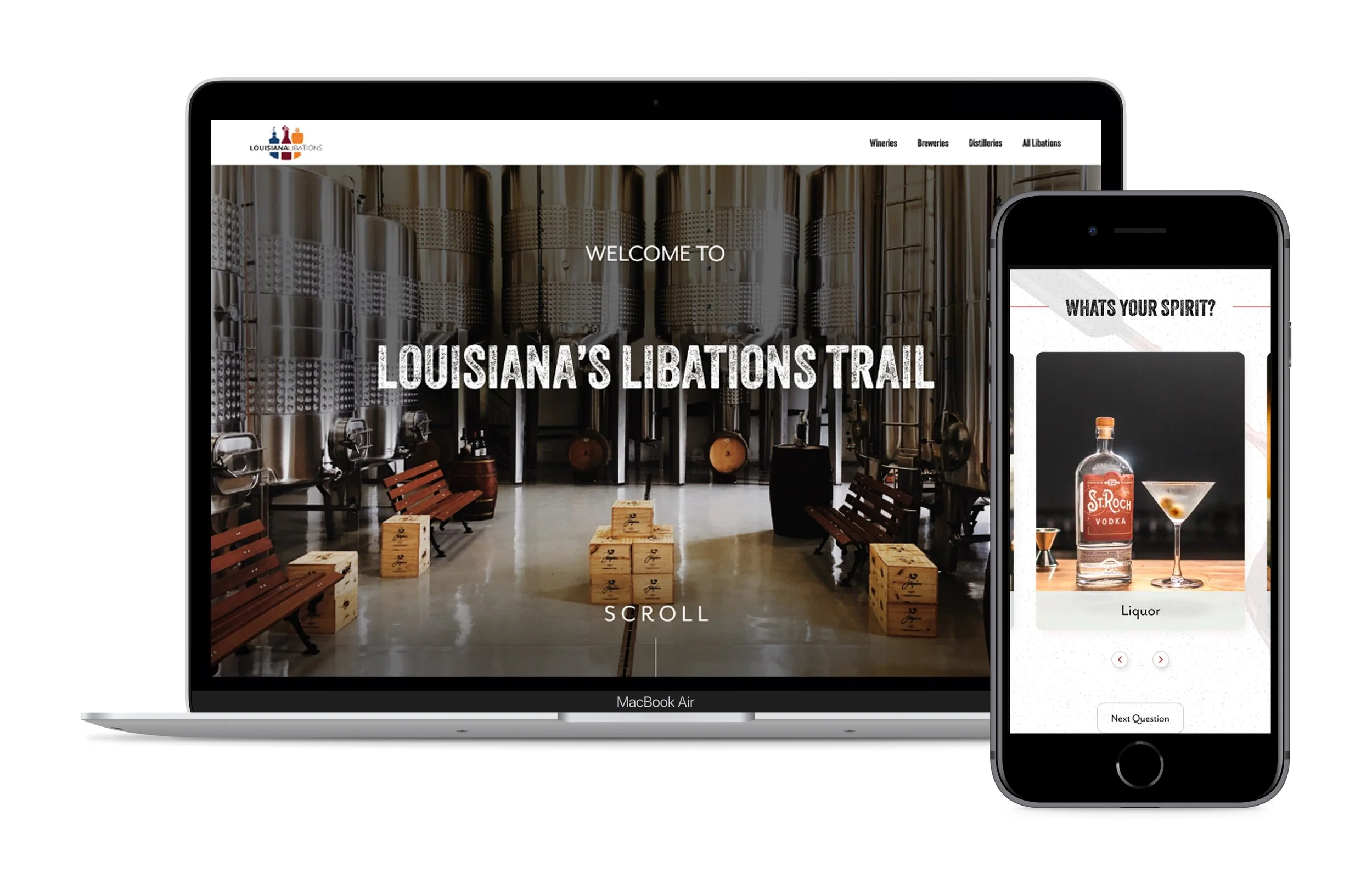
Louisiana Libations
Louisiana Birding (won outstanding award)
Louisiana Music Trails
Role
Sole UX/UI Designer
Following the successful launch of Louisiana Libations, Explore Louisiana engaged us to redesign their Culinary Trail website ahead of their Year of Food initiative. The goal was to harmonize the site's design with the Libations brand, while creating an interactive and engaging experience that authentically showcases Louisiana's cuisine. Below are the historical key pages before the redesign.
Home Page
Experiences Page
Given the tight deadline, I presented a low-fidelity mood board to the client, showcasing the brand's typography, color palette, and a proposed illustration style to highlight Louisiana's unique ingredients. Additionally, I outlined the concept of reusable card components and button styles to create a consistent and engaging user experience.
Once the mood board was approved, I transitioned to the visual design phase. Working in tandem with the development team, I prioritized the introduction of only 2-3 innovative components to elevate the user experience. Simultaneously, I redesigned existing components like listing grid cards, video players, and headline/body text elements to align with the new visual language. To maintain consistency and efficiency, I integrated previously designed card components from the Louisiana Libations site, customizing their styles to fit the Culinary Trail's aesthetic.
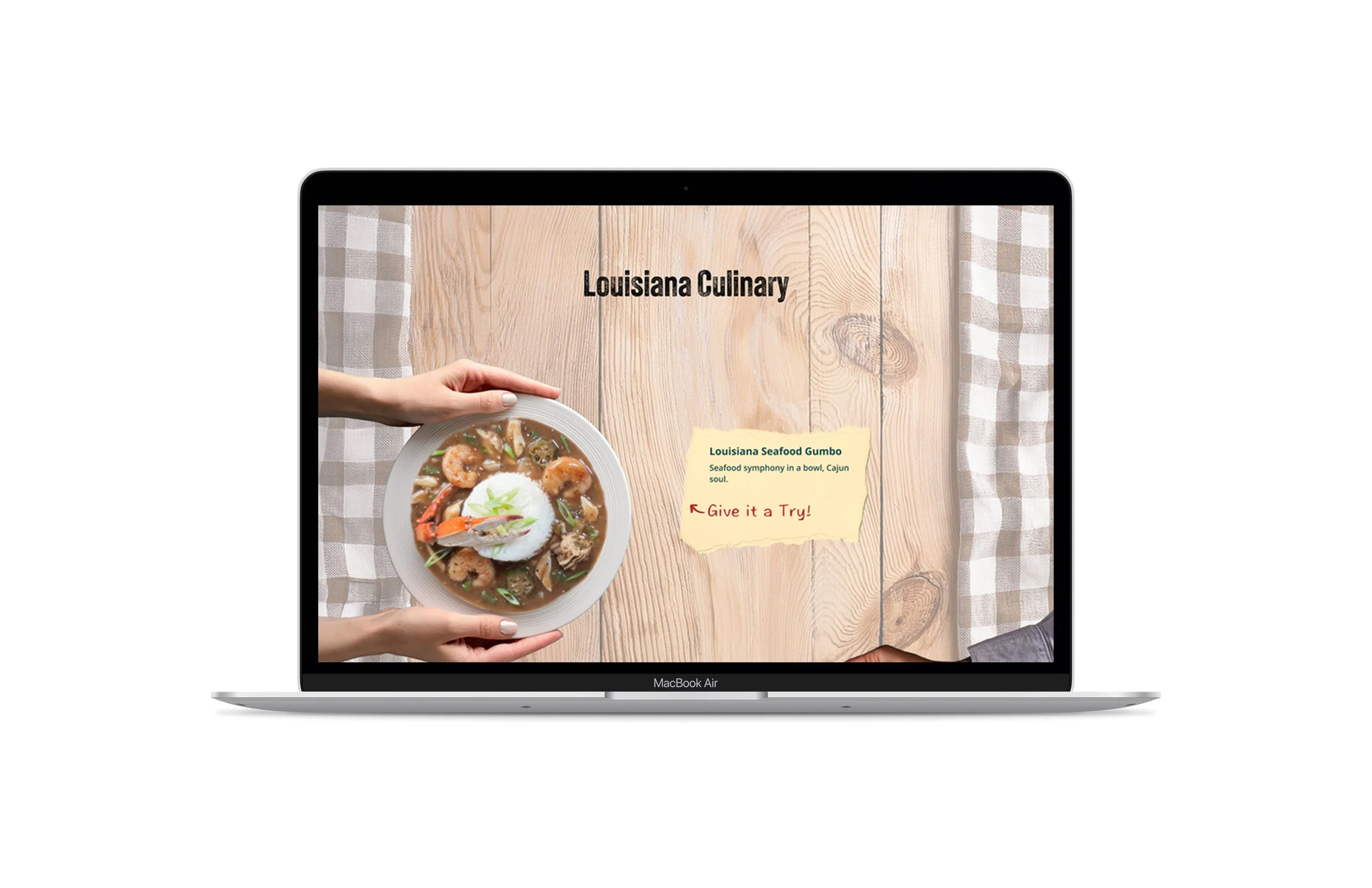
To create an engaging homepage experience, we introduced an interactive hero component that presents Louisiana's iconic dishes as if they were displayed on a picnic table. Each dish is clickable, allowing users to explore the recipes in detail. Below the hero, we implemented "Farm Table Cards" to showcase culinary experiences. These cards feature headlines, descriptive copy, and Polaroid-style images, creating a nostalgic and inviting atmosphere. To further enhance the visual appeal, we incorporated illustrations highlighting Louisiana's key ingredients, such as the Cajun trinity and seafood. Finally, a simple recipe grid showcases iconic dishes in a hand-drawn style, evoking the timeless nature of Louisiana's culinary traditions.
Client
Colorado
Role
1 of 3 UX/UI Designers
Focus:
Dev Handoff
Article Types
Trip Advisor Integration
Reviewing Hotjar Insights
Recipes Pages
Client
Hilton Sandestin
Role
1 of 2 UX/UI Designers
Focus:
Animations
Galleries
Eat & Drink
Experiences
Dev Handoff
Lets Brag
Upon joining the agency, I was tasked with developing inspiring web mockups to secure San Diego as a client. By thoroughly analyzing the existing website and conducting user research, I created compelling design concepts that effectively showcased the potential for a redesigned digital experience. These mockups ultimately played a pivotal role in securing San Diego's commitment to our agency for a full-scale web development project.
Approved to Launch
New builds and feature components approved by clients to launch in 2025.
Client
Greater Miami
Task/Role
UX/UI Designer creating AI Algolia Chatbot Mockup to be implemented on their site for both desktop and mobile. This feature is currently with Miami’s in house dev team.
Client
Visit Winston Salem
Task/Role
UX/UI Designer creating new feature components as part of a “face-lift” initiative for our smaller budgeted client. This feature will allow the client to upload their own video content while maintaining their brand visibility.
Side Projects with spline 3d
Designed and animated in Spline - 3D
Japan landing page concept designed in Figma - imported into Spline 3D for a rainy mouse cursor colliding with a useless but aesthetically pleasing sphere.
404 mock inspiration designed in Figma - then imported into Spline - 3D for animation.
These mocks are interactive! Press down on your mouse pad to enjoy :)