Buynoir
BuyNoir is a B2C e-commerce software platform empowering Black-owned businesses. Recognizing the platform's challenges, including a fragmented user journey for new entrepreneurs, unclear communication of the company's mission, and limited visibility for internal job opportunities, I was tasked with redesigning several key pages: the Landing Page, Account Creation, Account Dashboard, Careers Page, Application Page, and Pricing Page.
Furthermore, I collaborated closely with the development team to ensure seamless translation of the Figma designs into the WordPress environment.
Mood-Board
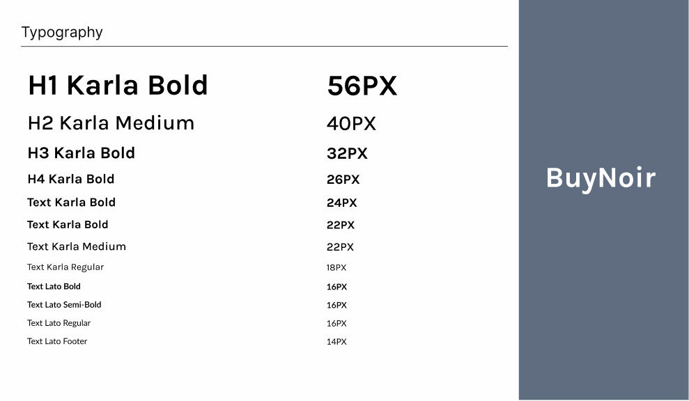
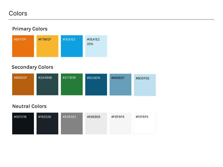
In close collaboration with the client, we undertook a brand refresh, refining their color palette, such as incorporating vibrant hues like #E8710F and #0EA1E2 alongside softer tones like #F7B62F and #699EB7, and typography, utilizing the bold and impactful Karla font family for headings and the versatile Lato font for body text, to create a vibrant and inclusive user experience that authentically reflects their brand identity.
Landing Page
As part of my research, I closely examined the existing BuyNoir homepage. I observed a clean and modern design with a strong emphasis on onboarding new users. The headline, "Start your Black-Owned Business," immediately grabbed my attention and clearly communicated the platform's core value proposition.
The subsequent section, "From the start and through the growth, we're here," effectively reinforced this message by highlighting BuyNoir's commitment to supporting businesses at every stage of their journey. The page was visually divided into three distinct sections, each clearly labeled and visually separated, making the information easy to scan and comprehend. The use of high-quality images and concise, impactful text effectively conveyed the platform's value proposition.
Furthermore, the inclusion of testimonials from successful businesses under the "Businesses that trust us!" section added a crucial layer of social proof, building trust with potential users. The prominent "Take the leap and start today" CTA button encouraged immediate action and seamlessly guided users towards the account creation process.
This analysis of the existing homepage provided valuable insights for my subsequent design work. By studying competitor platforms like Wix and Shopify, I was able to identify best practices in user onboarding and incorporate them into my design for the account creation flow. I leveraged the key elements of the BuyNoir homepage, such as clear messaging, strong visuals, and a focus on user benefits, to create an engaging and user-friendly account creation experience that seamlessly guides new entrepreneurs onto the platform.
Pricing Page
As I began the Pricing Page, I focused on creating a clear and concise presentation that effectively communicated the value proposition of each plan. I employed a clean and visually appealing aesthetic, consistent with the overall brand identity.
To enhance readability and visual hierarchy, I used contrasting colors to visually differentiate each plan: Start, Grow, and Community. Each plan is presented with a clear monthly price and a concise list of included features, making it easy for users to compare and choose the option that best suits their needs. I utilized checkmarks to enhance readability and highlight key features within each plan.
To further emphasize the value proposition, I included a dedicated section titled "Enjoy these features in our plans!" This section highlights key features common across all plans, such as Online Store, Sales Channel, Inventory Tracking, and 24/7 Support.
A prominent "Start Free Trial" button under each plan provides a clear call to action, encouraging users to take the next step and explore the platform further. The footer section includes relevant links to other pages, social media icons, and a newsletter subscription form, encouraging further engagement and building a relationship with potential customers.
The overall design is user-friendly and visually appealing, making it easy for potential customers to understand and choose the plan that best suits their business needs.
Careers/Application Page
For the BuyNoir Careers Page, I focused on creating a user-friendly and efficient platform for potential candidates to explore career opportunities. The page features a prominent "Find your role at BuyNoir" headline and a robust search bar, empowering users to actively search for relevant positions. I incorporated filters for Departments, Employment Type, and Location, allowing users to quickly refine search results and find positions that match their preferences. Each job posting is presented with a concise and informative format, including key details such as Job Title, Department, Employment Type, and Location. A brief job description provides a clear understanding of the role's responsibilities and requirements. The "Apply Now" button encourages immediate action and guides users towards the application process.
The Application Page was designed with a user-centric approach, prioritizing a seamless and efficient application process. The form presents essential fields such as First Name, Last Name, Email, Phone Number, and required links to LinkedIn and Portfolio. While not explicitly visible in the image, I would have included visual progress indicators to enhance the user experience and provide a sense of forward momentum. The form is designed with a focus on usability and accessibility, ensuring that it is easy to navigate and usable by individuals with disabilities. A prominent "Submit" button encourages candidates to complete the application. The page also includes a concise message about the application process, addressing any potential questions or concerns candidates may have.
Both the Careers and Application Pages aim to create a positive and engaging experience for candidates. By focusing on user-friendliness, accessibility, and clear and concise information, these pages contribute to attracting top talent and building a strong employer brand for BuyNoir.
Account Creation Flow
"The BuyNoir Account Creation flow was designed with a strong focus on the user experience. I paid close attention to creating a clear and progressive flow, guiding users through the process with a sense of accomplishment. The use of numbered steps and visual cues, such as contrasting colors, enhanced the visual hierarchy and made it easy for users to navigate. I incorporated clear and concise messaging throughout the flow, ensuring users understood each step and their progress.
I focused on providing feedback to users at every stage, such as error messages and a summary of entered information, to build trust and confidence. The "Store is successfully Created!" message, accompanied by a visually appealing image, provided a positive and encouraging experience for users upon completion of the account creation process.
The Dashboard page further enhances the user experience with a clear and intuitive interface. The sidebar with its well-organized icons provides easy access to key features and functionalities. I incorporated a prominent call to action, "Explore Store," to encourage users to begin interacting with their newly created online store.
Overall, I aimed to create a flow that is not only functional but also visually appealing and engaging. The emphasis on user experience, clear communication, and positive reinforcement resulted in a successful account creation flow that sets a strong foundation for users to thrive on the BuyNoir platform.
For the BuyNoir Dashboard, I aimed to create a user-friendly and intuitive interface that provides users with a clear overview of their store's performance and key functionalities.
I started by implementing a clear and concise navigation menu on the left-hand side. The use of icons and descriptive labels makes it easy for users to quickly locate and access different sections of the dashboard, such as Branding, Sales, Catalog, and Customers.
The main dashboard area displays key information and actionable insights. The "Activity" section provides a welcoming message and encourages users to start the onboarding process. I incorporated a video element within the "Activity" section to visually guide users through the initial setup. The "Top Revenue Channels" section, currently displaying 0%, provides a visual representation of store performance and will evolve as the user generates sales.
I designed the "Recent Invoices" section with a loading indicator to provide visual feedback while the data is being fetched. This helps to maintain a sense of activity and responsiveness.
Overall, I focused on creating a clean, uncluttered interface with a focus on usability and visual appeal. The dashboard provides a central hub for users to manage and grow their online businesses, empowering them with the tools and information they need to succeed.

